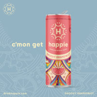
In the cannabis industry, it’s vital for your brand to stand out and engage your target customer at every touchpoint. When it comes to your visual identity, choosing the right design style is more than just what looks good to you. It comes down to creating a brand ethos, understanding your customer, defining a brand personality, assessing your budget and time and choosing a designer. In order to harness the power of illustration to take your cannabis brand’s visual identity to new heights, you must consider all of these factors when crafting your strategy.
Creating a Brand Ethos
When you begin to build out your cannabis brand, developing your brand ethos is the perfect place to start. There are many factors to consider. First, remember to be true to who you are because people will see right through you if you try to be something you aren’t. Then, spend the time to write down what you’re passionate about and make sure all areas of your business and brand align with those values.
Next, understand what you do better than anyone else and scream it from the rooftops. That is your differentiator. That is what your customers will come to know you for. After defining what you do best, build up a reputation around it and continue to grow in a positive direction.
Lastly, make sure your design, packaging and messaging are all consistent and work together in a cohesive way. I’ve found that consistency is key in everything from the product quality and your look to your communications and interactions with customers.
Understanding Your Customer

Remember, you can’t be everything to everyone. So many people are under the impression that everyone is going to want their product, but that couldn’t be further from the truth. With the cannabis industry evolving at lightning speed, there are more consumption options than ever before. You still have those true to smoking leaf; others are looking for concentrates, while some want the smoke/smell free route of edibles and beverages. Each of these cannabis products are going to target a different audience and demographics, and all of that needs to be taken into consideration when building your brand.
For instance, edibles are an easy way for someone to first try cannabis. By taking a more educational approach to the packaging, brands can help those customers feel more comfortable with their first cannabis purchase. At the end of the day, people want to know what they are getting into and how it is going to affect them. This should always be taken into consideration when deciding on the design style for these products.
Defining A Brand Personality
I always like to reference the craft beer world when talking about cannabis these days. As craft breweries popped up, the successful ones always had two things: a great product and a great personality that connected with their community. The same should be said for cannabis.
Start with a great product and build a community that appreciates your character and wants you to stay true to it. Are you punk? Are you a stoner brand? Are you taking more of a scientific approach? Whatever speaks loudest to YOU, make sure that approach is carried through to your customer. You will earn their trust and they will appreciate that you stay true and genuine to who you are.

Once you identify what your brand personality is, then you can start to make decisions on your logo, packaging and verbal communication. Get with your trusted designer and/or illustrator (more on that below), and start to make decisions about what style fits your brand best. Will your look be clever, vibrant or all-natural? Will it be illustrative or photo-forward? There isn’t a one size fits all solution.
Remember to not slack on having your communication match the look, feel and personality of your brand. With a cohesive visual and verbal identity, you’ll be able to create magical moments where the consumer feels like they are uncovering something special when they make a genuine connection with your cannabis brand.
Assessing Your Budget & Time
Budget and time are two HUGE components of deciding what visual direction to take. This is where you’ll really start making decisions about whether you should go with an illustrative design style. While illustration can take your cannabis brand’s visual identity to the next level, there are pros and cons to going that route.
Overall, illustration can be time-intensive and expensive depending on the illustrator and complexity of the work. If you want to have a different illustration for every strain you cultivate it can get pricey, but it may also set you apart from the competition. You have to weigh if the upfront cost of having something created will help differentiate your brand long-term. It is a much easier decision when you only have a couple of SKUs to start with or you choose a simpler illustration style, as these have less potential to initially set you back.
Pros:
- Most importantly, you get to work with people who are as passionate about their craft as you are in yours. Find an illustrator with a style that you like that fits your brand. I find it harder to find an illustrator and ask them to conform their approach to fit your look. It can be done as there is a lot of talent out there, but if you find someone that is already creating what you like, it will be much easier to get what you’re looking for.
- You’ll be able to develop a look and feel that sets you apart from the rest of the crowd. Illustration evokes emotions and tells a story, which can be quickly identified by a potential customer.
Cons:
- Timing is huge. Make sure you find an illustrator you trust that can turn things around when you need it. Give the illustrator plenty of time to execute your vision as well.
- Budget comes into play as now you need to hire a designer and an illustrator. There are some designers that illustrate as well, but these are diamonds in the rough.
- If you need a new illustration for every product, that will cost more than simply updating a name and colors in a design system.
- As many cannabis products are small format, it can be tough to truly highlight the detail in a great illustration.
Choosing A Designer

Finding a designer that focuses on illustration and whose style reflects your brand’s look and feel is important because it’s critical to be on the same page. Sometimes finding a designer AND an illustrator is the way to go. Even if you love the designer’s work, if it doesn’t fit with your brand’s look/feel, you won’t be happy with the end result. A good designer will be able to work with a good illustrator and vice versa.
Questions to ask potential designers include:
- Are they taking new clients?
- What do turnaround times look like?
- How much is the project going to cost?
- Do you own the artwork when they are done?
It’s incredibly important that you get along with the designer and/or illustrator you choose to work with. There are a lot of choices and it always helps to work with people that share the same values that you do. To open up your options, you can choose illustrators that are at different levels in their careers. A college student may be less expensive, but not have the professional and business experience you need, while a seasoned illustrator has more expertise to bring to the table, but may be more expensive.
The goal is for the designer and/or illustrator you choose to successfully create a visual identity to capture your cannabis brand’s essence and character.
The bottom line is that your visual identity is a critical component of your brand. Make sure you build it in the right way, so you can attract customers who align with and appreciate your cannabis brand identity’s look and feel. Cheers!


