Even the most traditionally-minded, tech-averse entrepreneur accepts their success relies on providing customers with a superior online experience in 2023. Trying to succeed without a robust web presence is akin to running the 100-meter with your legs tied together.
On that note, the legal cannabis industry might have a leg up over other sectors in providing superior experiences online. After all, the legal cannabis market is relatively new, meaning no legacy systems require any rehauling. Still, many dispensaries must start their websites from scratch.
A website bolstered by an excellent user experience offers many benefits (e.g., branding and additional revenues), but ground-up projects are daunting. Fortunately, the insights below will make your web design process more manageable.
Design Your Website To Click With Your Customer Base.
The primary commodity of all dispensaries is the same. Yet, each dispensary is different. They all have unique branding, voices, and stories they’re trying to tell.
Moreover, every dispensary wants to provide customers with a brand-specific experience. There’s no one-size-fits-all dispensary website for the above reasons.

Even so, the following general best practices will be conducive to streamlined, successful dispensary website design. While every website designer or agency has their own process, this process has proven to be extremely effective for the dispensary clients we’ve helped:
Develop an outline and wireframe for the website’s structure and content:
- A guiding principle during this process is to include the necessary pages and sections to optimize vital brand components and effectively promote products.
- Other factors to consider are sections, features and calls to action.
- Dispensary websites should contain educational content and resources.
- Fluid, straightforward navigation should also be prioritized.
Move onto the front-end design:
- Incorporate and harmonize multiple brand elements.
- Identify aesthetically pleasing typographies and imagery.
- Design each page outside of the content management system. This makes it easier to make changes and adjustments after the first draft has been completed.
Get feedback from relevant parties (e.g., clients, colleagues, management, or other stakeholders):
- Transparency and open communication are paramount to this step.
- This phase will ensure that all expectations for the new design are met while providing a platform for course correction as needed.
Use the feedback to create a foundational website framework:
- Meet for a second feedback session before committing 100% to a web design framework.
Develop the website inside of your content management system of choice:
- Now that the front-end design has been created, the website will be built out in the actual CMS platform, ex. WordPress.
- Share every page with other relevant parties to maintain and foster the web design process’s fluidity.
By now, you should have a solid base for the website’s final form:
- The stage involves fine-tuning as the launch date nears.
- Also included at this point are the following:
- Ancillary page development.
- Dispensary menu integration.
- Tablet/mobile optimization.
- Speed/performance tests.
- Contact form designs.
- Lead capture setup.
One last guiding principle in web design is to view your website through a user’s eyes. Continually assess how intuitive and convenient it is to navigate your site as a customer.
Optimize The Customer Experience With Seamless Navigation
Dispensaries benefit by guiding visitors to their website’s most important sections.
It’s an understandable oversight only to prioritize seamless navigation to the menu page. However, customers will be less inclined to order if they can’t access educational content to learn more about your products. Plus, they may want to visit your physical store, so they’ll wish to view your location information.
Furthermore, visitors sometimes need clarification about what they want from your website. Build their pathway with insightfully structured navigation systems with clear prompts, calls to action and an emphasis on the following:
- Specifics about store and location
- Brand information
- Where to find responses to FAQs
Lastly, be mindful of the mobile experience on your website. Your customers expect seamless navigation on their phones and tablets as much as on their laptops and desktops.
More people will visit and shop your menu on the mobile version of the website than the desktop version, so it needs to take priority in the design process.
Create an Intuitive Online Ordering Process
The ordering component of the customer experience is integral to receiving desirable returns on your online investment.

Of course, every visit counts and brands are happy to educate consumers. A steady, always-growing stream of eCommerce transactions paints a winning picture of your site’s navigation. More to the point, success with online orders means you’ve optimized the ordering experience.
Intuitive, easy-to-parse menu systems are a must when optimizing online ordering.
Ensure that your customers are one click away from their preferred menu and location (if you have multiple locations), regardless of where they are on your website. It’s even better if those pages can rank on Google based on local searches (e.g., Pennsylvania dispensary menu).
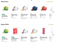
Online shoppers also respond well to search filters on your menus, such as:
- Products with the highest or lowest THC levels
- Products with the highest or lowest CBD levels
- Specific strain types (i.e., Indica, Sativa and Hybrid)
- Product types (e.g., flower, concentrate, oil or edible)
Build A Robust Resources/Information Section
Almost every branded website has a resource/information section. In some instances, it’s a blog. For other brands, it’ll be eBooks, guides, case studies, press releases, videos or news articles.

A resource/information section is uniquely vital to cannabis brands. Many prospective customers will be first-timers and require sure-handed wisdom to guide them through the experience. Also, many seasoned enthusiasts want to learn about the latest trends and the best new strains.
Furthermore, providing resources and information is a form of education. This “teacher” approach helps push back against stigmas by focusing on cannabis’s nuances and benefits.
Consider using a “pillar page” system to organize your informational content (e.g., blogs, videos, eBooks). Doing so will make it seamless for website visitors to learn about strains, terpenes, upcoming community events, consumption methods or information about local cannabis laws.
It helps to customize each pillar page with an icon and create an individual page for every post in a given category. This way, newly published content will automatically appear under its associated pillar page.
Other Considerations
We understand the budgetary challenges many dispensaries face when getting off the ground. You can grow your budget by making decisions and taking educated risks that generate returns.
Your customers’ online experiences are a worthy investment. Nonetheless, are you investing wisely by building (or redesigning) your website in-house? After all, your team’s expertise is in cannabis sales (or cultivation). They’re smart enough to learn as they go, but would this trial-and-error web design process be efficient or ideal for your dispensary’s bottom line?
Conversely, working with a Consulting Group like MOST who specializes in dispensary website design can ensure your website generates the desired returns and results. Contact us today to learn more.


